The Author – Bart Busschots
Creative Commons
Unless otherwise stated, the content on this site is licensed under Creative Commons Attribution, Noncommercial, No Derivative Works 3.0 License


Sep
16
Writing Presentations With Keynote ’08
Filed Under Computers & Tech on September 16, 2007 at 4:36 pm
I have been an iLife user for years but hadn’t previously bought iWork because it was lacking a spreadsheet program. When iWork ’08 came out with Numbers I decided the time was right to give it a go. Just to put things into perspective, at work I use Microsoft Office (the Mac version), and at home I’ve been using OpenOffice and NeoOffice. OpenOffice and NeoOffice always strike me a striving to emulate MS Office, iWork doesn’t do this. It sets out to do Presentations, Documents and Spreadsheets in a simple and accessible way. It’s refreshing to use an office package with a simple interface instead of the usual glut of buttons everywhere. I’ll be writing about Pages and Numbers in the future but today I want to talk about the oldest of the iWork applications, the presentation app Keynote. This review is based on my experiences creating and then presenting a talk about science to students at my old secondary school the week before last. You can read about how I got on here see a PDF of my slides here.
[tags]Apple, iWork, KeyNote[/tags]
Familiar Yet Different
In some ways the Keynote interface is very familiar. You have a pane down the side with thumbnails of your slides and a large pane next to it with the current slide in it. Like PowerPoint there is a menu bar across the top, however, it’s a very different menu bar. It has just a few large and clear icons instead of the usual MS soup of tiny pictograms. Like other Apple applications Keynote uses an inspector pane to allow you to manipulate the properties of various elements of your presentation. However, rather foolishly in my opinion, the inspector pane is hidden by default. For those who actually like the MS office way of having all your formatting details in the menu bar there is a button which lets you bring up the “format bar”.
Sample Screen Shot – Click to See Full Size
Two Minor Gripes
The inspector pane works, but in my opinion it could work better. The functions within the inspector pane are very logically broken down into ten sections including ‘Document’, ‘Slide’ and ‘Text’. Each of these sections are grouped into a tab and there are ten buttons across the top of the inspector pane to allow access to these groups of options. Many of these panes are then broken into sub-panes. The screen shot below shows the inspector with the “Slide” tab selected. You can see that this section contains two sub-tabs.
Personally I find I spend a lot of time flipping through those ten inspector panes and I wish I could bring up two panes at once. A simple way to do this would be to have each of these ten panes stacked on top of each other and then make them all collapsible so you could keep the two or three you use most expanded at all times. Failing this it would even be an improvement to allow multiple instances of the inspector pane to be open at once.
In a strange turnaround Office for the Mac has had this kind of inspector for years! The screen shot below will be totally alien to Office users on Windows but these are the inspectors Office uses on the Mac and it’s these type of inspectors I’d like to see Apple use throughout iLife and iWork.
However, it should be pointed out that the inspector does work and does so in a way that is consistent with other iWork and iLife apps. In some sense it’s now what users expect, and it is at least consistent.
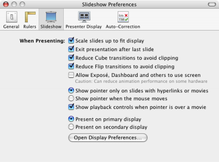
My second minor gripe involves a poor choice of default setting. It is true that 1024×768 is the most common projector resolution so it makes sense that by default Keynote slides are optimised for that display resolution. However, it does not make sense to present the slides at that resolution regardless of the resolution of the projector actually being used! By default if you display your Keynote slides on a display larger than 1024×768 the slides will not fill the whole screen and there will be a black border around them. What makes this even more stupid is that Keynote has the ability to scale the slides up to fill the display, it just doesn’t do this by default. Instead you have to go to Keynote -> Preferences ... -> Slideshow and the check Scale slides up to fit display check-box. This really should be the default setting. (I have no idea what Keynote does if it meets a projector with a lower resolution than the slides were created for.)
A Good Helping of Apple Polish
In general I find Keynote much easier to use than PowerPoint and much less intimidating. The built-in templates are much more polished looking as are many of the slide transitions. You can of course export from Keynote to PowerPoint format but when you do a lot of the polish vanishes because it’s not supported by PowerPoint. The three dimensional slide transitions in particular are very cool but of course not supported in PowerPoint.
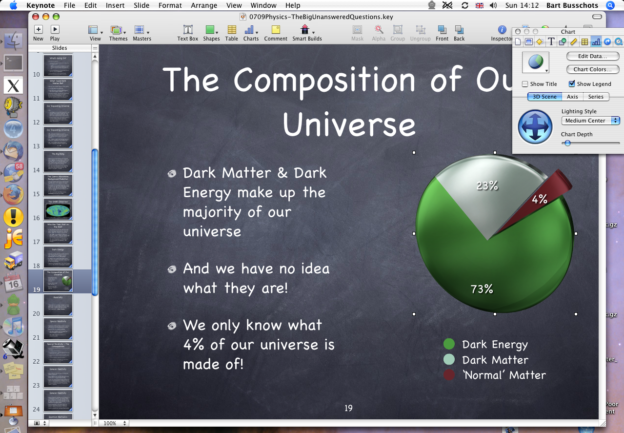
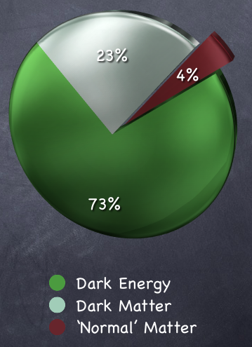
What really struck me is how easy it is to make spectacular charts and graphs. There is a simple interface for entering the data and then choosing the type and colours for the graph. If you choose a pie chart you can then very easily explode a slice to highlight a point. What is even better is that these fabulous charts DO make it over to PowerPoint when you export. However, they are not editable within PowerPoint because they are exported as images. The graph below took me literally a few seconds to generate.
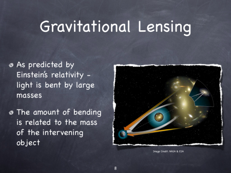
Another nice touch is Keynote’s support for cool picture frames. It’s simple to add a border to any image you add to your presentation but Keynote goes much further than simply adding a border around your image. There are many other cool effects available. The one I used for my slides makes the edges look tattered and adds a shadow to give your images a 3D effect. There are many other effects and many of them really compliment the various built-in templates. This is not strictly speaking critical stuff but it adds that little bit of extra polish to your presentations to give them that all important edge. These borders also make it over to PowerPoint but again are not editable there.
A Helping Hand While Presenting
Keynote doesn’t just make it easy to create presentations though, it also gives you a helping hand when it comes to presenting your work. When you are presenting you are usually using two displays, your laptop’s screen and a projector. All other presentation programs I’ve used have just mirrored the content being displayed on the projector on the laptop screen. This at least lets the presenter see what’s on the display behind them but it’s no more use than that. By contrast Keynote really makes use of your laptop display while presenting. It presents two slides and two counters on that screen. It shows the current slide and the next slide, and it shows the current time and how long you’ve been presenting. All exceptionally helpful when you’re making a presentation.
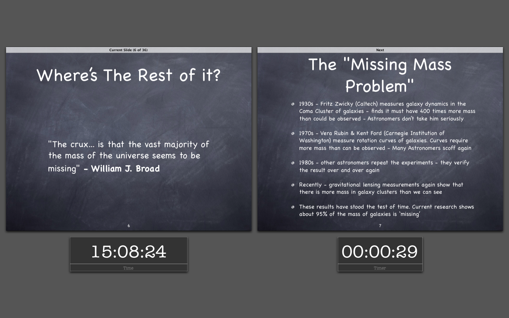
Presenter Display – Click to See Full Size
All new Macs ship with an Apple remote so it makes sense for Keynote to use it. As you would expect you can move from slide to slide with the remote, but it gets better. When you press the menu button on the remote you get a bar with thumbnails of all your slides on the laptop display which you can then scan through with the remote to select a slide to jump to. While you do this your audience only see the current slide you are presenting. This is exceptionally useful at the end of your talk when it’s time for questions.
Conclusions
If you want an application that lets you create and deliver professional looking presentations with the minimum of effort then Keynote is for you. It really is both the simplest and the most powerful presentation application I’ve ever used. The only negative thing I can say about it is that it’s inspector interface could be even better and one of the default settings is stupidly chosen. From me that’s exceptionally high praise indeed. This is a total cliché but – it just works!
Yeah, I’ve been playing with Keynote 08 for a while now, it does work pretty well. I’m looking forward to giving a presentation using it 🙂
Numbers is also intensely deadly. It’s like Excels prettier younger sister.
Pages is apparently deadly , but I haven’t had time to use it properly.
I really really hate to say something nice about Powerpoint, but they have had the running clock thing during a presentation for a while now…
Other than that, I think Powerpoint was written by aliens.
[…] a low priced light image editing application, Bart’s review of Apple’s new Keynote at bartbusschots.ie/blog, and his Physics lecture , and Allison hacks her iPhone, see the video at […]
“Personally I find I spend a lot of time flipping through those ten inspector panes and I wish I could bring up two panes at once”
FYI – You can open more than one inspector window at the same time. While an inspector window is open, hold down the the Option key and click on, say, the Table, Slide, or Build button. A second inspector window will open…. do it over & over for a third, fourth, fifth, etc.
Fantastic, thanks KD!
Bart.
Hey, just wanted to ask you something, I presented with keynote yesterday and when i clicked on view show, the snapshot that you have up there is what was on the screen and not my laptop! Is there a setting that I have to configure or what? 🙂
Hi Jessica,
The way it works is that your primary display (the one that has the menu bar on it) is used for the presentation and the other one for the presenter display. You can change that around by using the System preference pane where you lay out your displays. Just drag the menu bar from one display to the other.
Hope that helps,
Bart.
Thanks. I changed the settings. it was because i made the slideshow play on the primary display. so I had the one with two on the projector instead. thanks1
how do you set keynote to be the default app for opening files with the .ppt extension?
Hi Ntrogdon,
There’s a few ways to do this but the way I do it is to go to the Finder and select any .ppt file. Then either right-click it and choose Info or just hit command+i. On that info window you’ll see the application that the file will open in. Select Keynote from that dropdown. Then click the button below it marked “change all”.
Hope that helps,
Bart.
Found your site after searching for knowledge on resolutions and what a breakthrough. Thanks. About to buy projector for presenting keynote slide show. Is a WXGA or a XGA the better choice.
Use a powerbook G4 with 10.3.9 and keynote 05 but may upgrade laptop as being restricted by operating system and memory. Prefer WXGA but not if it distorts slides.
Thanks for any help.
Ray
“By default if you display your Keynote slides on a display larger than 1024×768 the slides will not fill the whole screen and there will be a black border around them.”
Does anyone know if it is possible to change the black border to white- or any other color?
Thanks,
nathan