PBS 58 of X — Bootstrap Breakpoints
We’ve now been introduced to two and a half of the four aspects of the Bootstrap web API. We’ve had our first look at the Bootstrap CSS utility classes. We’ve also looked at many of the CSS classes Bootstrap provides for styling standard HTML elements (content in Bootstrap jargon). Now we’re about half way through our look at Bootstrap’s layout CSS classes. So far in terms of layout we’ve met the Bootstrap grid and learned about how it breaks your page into container that contain rows that contain columns, and how column widths are expressed as twelfths of the container width. In this instalment we’ll take our first look at Bootstrap’s support for responsive design by looking at how the Bootstrap grid layouts can be altered depending on the viewport width.
There is more to Bootstrap’s support for responsive design than just the grid. In the next instalment we’ll look back a little and discover that many of the bootstrap utilities and content classes also support responsive design. After that we’ll be ready to move on to the fourth and final aspect of Bootstrap: its collection of non-standard but commonly needed HTML elements, or components in Bootstrap jargon.
You can Download this instalment’s ZIP file here or here on GitHub.
Matching Podcast Episode 555
Listen along to this instalment on episode 555 of the Chit Chat Across the Pond Podcast
You can also Download the MP3
PBS 57 Challenge Solution
The challenge set at the end of the previous instalment was very simple — edit the recipe you’ve been working on over the last few challenges to use the Bootstrap grid for layout. The challenge was to produce a layout that looks good on regular desktop and laptop screens.
I always say there is no single correct answer to these challenges, but that really couldn’t be more true here — we’re all starting off with a different starting point, and we all have different opinions on how we want our recipe laid out. So we’re all going to produce wildly different final pages. I’m including my sample solution as an additional worked example more than anything else.
I chose to group my display heading and lead paragraph together into a single container, and to use the HTML5 semantic <header> tag to do so. I decided to place the two elements (the display header and the lead) into a single row, and to give the majority of the space to the display header, and just 3 atomic columns to the lead paragraph next to it.
I then chose to group the remainder of the page into a second container, and I used the HTML5 semantic <main> tag for that. For this container I decided to use multiple rows rather than a single one.
On the first row I included a 3-atomic-column wide sidebar for the ingredients and the aside about cucumbers, and left the remainder of the row for the instructions and the figure, which I chose to float.
Finally, I placed the equipment list and glossary next to each other on a final row as two equal-width columns.
One important subtlety I do want to draw your attention to is my sticky-top header. The only way to keep that working is to make the entire container sticky top. Doing it on a per-row level will not work because the Bootstrap classes sticky-top and row are not compatible with each other.
I’ve included my full recipe in the pbs57-challengeSolution in folder this instalment’s ZIP or here on GitHub.
However, the focus of this challenge was the overall structure, and that’s easier to see with most of the page content removed:
<header class="container sticky-top mt-3">
<div class="row align-items-center bg-white border-bottom">
<div class="col-9">
<h1 class="display-1">Roasted Cucumber<br> <small class="text-muted">with Red Onion & Dill</small></h1>
</div>
<div class="col-3">
<h2 class="sr-only">Description</h2>
<p class="lead">...</p>
</div>
</div>
</header>
<main class="container">
<div class="row mt-3">
<div class="col-3">
<table class="table table-sm text-muted table-hover">
<thead class="thead-light">
<tr>
<th class="">Ingredients</th>
</tr>
</thead>
<tbody>
<tr>
<td>1 cucumber</td>
</tr>
<!-- ... -->
</tbody>
</table>
<aside class="border border-info rounded p-2">
<h2 class="text-info d-inline-block align-middle">Did you Know?</h2>
<p class="text-muted d-inline">The Cucumber is...</p>
</aside>
</div>
<section class="col-9">
<figure class="text-center figure d-block float-right w-50">
<img class="border rounded img-fluid figure-img" alt="Roasted Cucumber with Red Onion & Dill" src="roastedCucumberWithRedOnionAndDill.png" />
<figcaption class="figure-caption">The finished product fresh out of the oven!</figcaption>
</figure>
<h2>Instructions</h2>
<ol>
<li>
<p>Wash the cucumber ...</p>
</li>
<!-- ... -->
</ol>
</section>
</div>
<div class="row">
<section class="col-6">
<h2>Required Equipment</h2>
<ul class="list-unstyled d-flex flex-row justify-content-between text-center my-3 mx-0 p-0">
<li>
<p><span class="fas fa-clipboard fa-5x"></span></p>
<p>A chopping board</p>
</li>
<!-- ... -->
</ul>
</section>
<section class="col-6">
<h2>Glossary</h2>
<dl>
<dt>Deglazing</dt>
<dd>The dissolving ...</dd>
<!-- ... -->
</dl>
</section>
</div>
</main>
Bootstrap’s Break Points
To support responsive design, Bootstrap is built around five named viewport width ranges known as breakpoints.
The first range is named xs, for extra small, and it’s intended for phones in portrait orientation. This is the default breakpoint, and it actually covers all possible viewport widths, being defined as any viewport with a minimum width of zero! Because xs is the default, you won’t see its name used very often.
The second range is named sm, for small, and is intended for phones in landscape mode. It’s defined as all viewports with a minimum width of 576px.
The third range is named md, for medium, and is intended for tablets. It’s defined as all viewports with a minimum width of 768px.
The fourth range is named lg, for large, and is intended for laptops and desktops. It’s defined as all viewports with a minimum width of 992px.
Finally, there’s xl, for extra large, which is intended for large-screened desktops. It’s defined as all viewports with a minimum width of 1200px.
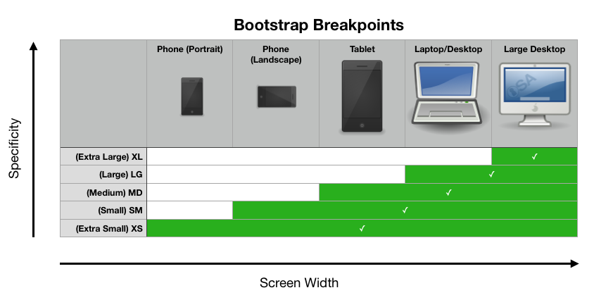
The Bootstrap breakpoints with Screen Width on the X axis and Specificity on the Y.
What you’ll notice is that the smaller breakpoints all encompass the larger ones, so how can that work? This is where specificity comes into play. The various Bootstrap classes that use these breakpoints have been designed so the ones for the larger breakpoints have a higher specificity than the ones for the smaller breakpoints. So, if you set styles for the medium breakpoint and for the large breakpoint, then while your viewport is wider than 992px both classes are in play, but the large one wins because it has a higher specificity. The moment you make your viewport narrower than 992px, the large class is no longer in play, so now the medium class takes over.
This probably sounds quite confusing and complicated, but don’t worry. Once you see it in action, it should make a lot more sense.
As we’ll learn next time, many aspects of Bootstrap make use of these break points, but we’ll start by examining their use with the Bootstrap grid.
Layout Design Guidelines
Before we move on to look at how the Bootstrap grid makes use of breakpoints to support responsive design I want to give you two guidelines to bear in mind when designing responsive layouts. Note that these are guidelines, not rules!
1 — Think Mobile First
The advice from the Bootstrap project is to think mobile first. That was their philosophy when designing the library, so you’ll find your life less stressful if you align your philosophy with theirs!
What this means as that you generally get better results when you start by making your layout work on small screens, and then use Bootstrap’s responsive design features to make your mobile layout adapt well to larger screens.
2 — Order Your Elements Semantically
As we’ll learn, the visual order things appear on the page, and the order they appear in the source code do not have to be the same. The source code order should be such that the page can be read with all styles turned off, which is effectively how search engines and screens readers see it anyway. If your source starts with the footer, then has the sidebar, and only then the main content, it would look ridiculous with all CSS turned off. Hence, it reads stupidly to search engines and any assistive devices that are not CSS-aware.
Breakpoints and the Bootstrap Grid
So far we’ve learned that columns in the Bootstrap grid are defined using tags starting with col. Just col alone means an automatically sized column. col-1 means a column one twelfth of the width of the container, col-2 two twelfths, and so on. These classes all have an implicit breakpoint of xs, so they apply to all viewport widths.
There exist similar classes for each of the other four breakpoints, i.e. col-md-4 means that the column should be four twelfths wide in all viewports that are at least 768px wide. There is also an automatic variant for each breakpoint, i.e. col-sm, col-md, col-lg, & col-xl.
Remember from last time that the full width of a container is 12, and that if a row contains more columns than fit, they wrap. If we combine these two facts with the break-point-specific col classes, we can create dynamic layouts. Let’s start with a simple example.
Take this very basic HTML as a starting point:
<div class="container-fluid my-3 text-center">
    <div class="row px-1">
        <div class="col p-3 border rounded bg-primary">
            <code class="text-white">.col-12</code>
        </div>
        <div class="col p-3 border rounded bg-secondary">
            <code class="text-white">.col-12</code>
        </div>
        <div class="col p-3 border rounded bg-info">
            <code class="text-white">.col</code>
        </div>
    </div>
</div>
(You’ll find a full page with this code in the ZIP or here on GitHub as pbs58a.html.)
This code gives us 3 equal-width columns at all breakpoints because col implies xs which covers all viewports from 0px wide up.
Let’s assume that three columns is just too much on a phone in either orientation. So let’s make each column full width by default by changing them all from col to col-12.
We now have a working layout for all phones, but on tablets, that seems like a bad use of space. Tablets are not wide enough for three by three, but they can handle two columns. So let’s leave the first column full width and make the second two half-width by giving them the additional class col-md-6.
Now try to resize the window. For viewports narrower than 768px there are three full-width columns stacked on top of each other, but once your viewport becomes wider you get one full-width column followed by two half-width ones underneath.
While our layout is now fine on phones and tablets, it’s still wasteful of space on laptops and smaller desktops. So let’s make it into three equal-width columns for large devices by adding the class col-lg to each of the three columns.
Finally, on very wide-screened devices the sidebars are becoming wastefully large. So what we’d like is for the first and last columns to be limited to 3 in the extra large breakpoint by adding the class col-xl-3 to both of them.
Your code should now look like this:
<div class="container-fluid my-3 text-center">
    <div class="row px-1">
        <div class="col-12 col-lg col-xl-3 p-3 border rounded bg-primary">
            <code class="text-white">.col-12 .col-lg .col-xl-3</code>
        </div>
        <div class="col-12 col-md-6 col-lg p-3 border rounded bg-secondary">
            <code class="text-white">.col-12 .col-md-6 .col-lg</code>
        </div>
        <div class="col-12 col-md-6 col-lg col-xl-3 p-3 border rounded bg-info">
            <code class="text-white">.col-12 .col-md-6 .col-lg .col-xl-3</code>
        </div>
    </div>
</div>
(You’ll find the full file in the ZIP or here on GitHub as pbs58b.html.)
Starting with your window very narrow you’ll get three vertically stacked columns. As you widen the window it will jump to two rows, one with one column, and one with two. As you widen the window more, it will jump again into three equal-width columns before finally jumping to a wider middle region between two narrower sidebars.
Welcome to the world of responsive design!
Reordering Columns
I mentioned in the guidelines that the visual layout and the order of elements in your source code don’t need to be the same. Let’s look at how we can achieve that.
We’ll examine this idea through a worked example — a relatively simple but very commonly used page structure:
<div class="container-fluid my-3 text-center">
    <header class="row px-1">
        <div class="col p-3 border rounded bg-primary">
            <h1 class="text-white">Page Header</h1>
        </div>
    </header>
    <div class="row px-1">
        <div class="col p-3 border rounded bg-info">
            <p class="text-white">Left Side Bar</p>
        </div>
        <main class="col p-3 border rounded bg-secondary">
            <p class="text-white">The main page content ...</p>
        </main>
        <div class="col p-3 border rounded bg-info">
            <p class="text-white">Right Side Bar</p>
        </div>
    </div>
    <footer class="row px-1">
        <div class="col p-3 border rounded bg-light">
            <p class="text-dark">Page Footer</p>
        </div>
    </footer>
</div>
(You’ll find the full file in the ZIP or here on GitHub as pbs58c.html.)
As you can see we have a full-width header, followed by the main content with a sidebar each side, followed by a full-width footer. As it stands, this page is not responsive.
A logical first start to making it responsive would be to make the three central columns full width by default by replacing the class col with col-12.
Scrolling down we now get the header, then the first sidebar, then the main content, then the second sidebar, and finally the footer. This is not actually the order we want — the most important stuff should always come first so people are not needlessly scrolling!
The order of the code here does not follow our guidelines — the main content should come before either sidebar. Let’s fix that by moving the left sidebar from before the main content to after it in the source.
This immediately makes things work properly in our mobile-friendly initial layout — we now see the header, then the main content, then the two sidebars, and finally the footer.
If we now try make this behave properly on medium-sized devices (and larger) by adding col-md-3 to each of the sidebars, we run into a problem: the main content area is where the left sidebar should be!
This is where Bootstrap’s reordering classes come in. Like I said, the visual order of columns in the grid does not have to be defined by their ordering within the markup. That’s just the default behaviour!
In Bootstrap all columns have an implicit order of zero. Columns are sorted by order first, and only when multiple columns share the same order does their position within the markup come into play. By default, all columns have an order of zero, so their order within the markup is what we see reflected visually in the page.
However, Bootstrap provides breakpoint-specific classes for altering the order values of the columns for each of the breakpoints. So, to set the order for a column to 2 for all breakpoints from medium up, you would use the class order-md-2. There are order classes from 1 to 12 for sm, md, lg, and xl. There are also order-1 to order-12 classes with the implicit breakpoint of xs.
Finally, and very conveniently, there are also order-XX-first and order-XX-last classes for setting the a column’s order to -1 and 13 respectively for each of the breakpoints.
In our example above, default ordering is working for all columns and breakpoints except one column for breakpoints from medium up. The left sidebar needs to move to the left of the main content area for those breakpoints. We can easily achieve that by giving that column the class order-md-first.
So, we now have a layout that meets best practice for assistive devices and SEO, and works well on both small and large screened devices:
<div class="container-fluid my-3 text-center">
    <header class="row px-1">
        <div class="col p-3 border rounded bg-primary">
            <h1 class="text-white">Page Header</h1>
        </div>
    </header>
    <div class="row px-1">
        <main class="col-12 col-md p-3 border rounded bg-secondary">
            <p class="text-white">The main page content ...</p>
        </main>
        <div class="col-12 col-md-3 order-md-first p-3 border rounded bg-info">
            <p class="text-white">Left Side Bar</p>
        </div>
        <div class="col-12 col-md-3 p-3 border rounded bg-info">
            <p class="text-white">Right Side Bar</p>
        </div>
    </div>
    <footer class="row px-1">
        <div class="col p-3 border rounded bg-light">
            <p class="text-dark">Page Footer</p>
        </div>
    </footer>
</div>
(You’ll find the full file in the ZIP or here on GitHub as pbs58d.html.)
Challenge
Update your recipe so its markup is in a semantically sensible order, and so its layout works well at all five breakpoints.
Final Thoughts
I intentionally skipped over all mentions of breakpoints when we took our first look at the Bootstrap utilities and the Bootstrap content classes. Now that we’ve learned about breakpoints, it’s time to circle back around at that previously ignored functionality.