PBS 53 of X — Bootstrap Utilities
We’ll start this instalment with a very quick look at my sample solution to the previous instalment‘s challenge. Then, we’ll really get stuck into Bootstrap.
As we learned last time, Bootstrap can be thought of as consisting of four separate chunks of functionality — layout, content, components, and utilities. Because utilities are universally useful, that’s where we’ll be start our journey. In this instalment we’ll meet our first few Bootstrap utility CSS classes.
You can download the ZIP file for this instalment here or here on GitHub.
Matching Podcast Episode 535
Listen along to this instalment on episode 535 of the Chit Chat Across the Pond Podcast
You can also Download the MP3
PBS 52 Challenge Solution
The challenge set last time was extremely simple — it was basically to write a recipe for a food or drink of your choice using the appropriate HTML elements, and include Bootstrap into the resulting page.
This challenge was not really about Bootstrap, it was really just a nice simple task to get you back into the HTML5 groove since it’ve been a while since we’ve practiced that muscle. Because it’s such a simplistic task, there’s nothing I particularly want to draw your attention to in my solution. You’ll find my solution in this instalment’s ZIP file.
A Custom Playground
The best way to see the effect of a CSS class is to add it to some HTML. To that end I’ve set up a very simplistic basic HTML 5 page into which you can quickly and easily add the classes to see what they do.
You can use the HTML page below (also in the instalment’s ZIP file as pbs53.html), or, this live interactive playground.
<!DOCTYPE HTML>
<html>
<head>
    <meta charset="utf-8" />

    <!-- Include Bootstrap 4 CSS -->
    <meta name="viewport" content="width=device-width, initial-scale=1, shrink-to-fit=no">
    <link rel="stylesheet" href="https://maxcdn.bootstrapcdn.com/bootstrap/4.0.0/css/bootstrap.min.css" integrity="sha384-Gn5384xqQ1aoWXA+058RXPxPg6fy4IWvTNh0E263XmFcJlSAwiGgFAW/dAiS6JXm" crossorigin="anonymous">

    <title>PBS 53 Dummy Page</title>
</head>
<body>
<div class="container-fluid mt-3">
    <div class="row">
        <div class="col-12">

            <!-- Start of Dummy Content -->

            <h1 class="">PBS 53 — Dummy Page</h1>

            <p class="">This page has some HTML elements that you can add Bootstrap 4 CSS utility classes to so you can see them in action</p>

            <p class="">When you look at the source for this page you'll notice empty class attributes in the HTML tags just waiting for you to add some Bootstrap class names into!</p>

            <blockquote class="">
                <p class="">'pretend I said something really witty and clever'</p>
                <p class=""><a href="http://bartb.ie/" target="_blank" rel="noopener">Bart Busschots</a></p>
            </blockquote>

            <!-- End of Dummy Content -->
        </div>
    </div>
</div>
</body>
</html>
Bootstrap Colours Utilities
We won’t be making use of this feature for a while, but it’s important to know that Bootstrap 4 supports themes. Why is this important? Because it explains why the colour utility classes exist, and why it’s important that you use them. A significant feature of a Bootstrap theme is custom values for the colour utility classes.
As a general rule, the colour utility classes have semantic names, and you should use them where they make semantic sense. For example, to render a success message, you might use:
<p class="text-success">It worked!</p>
For today we’ll just look at the text and background colour utilities. But when we start looking at Bootstrap content and component related CSS classes, we’ll see the same names cropping up over and over again. For example, the CSS class btn-danger can be applied to a button to make it clear that the button does something destructive like deleting an item. You can use the class alert-danger on an alert component to render an important message that really has to catch the user’s eye.
While the same names come up over and over again, not all names make sense in all contexts, so some permutations don’t exist. For example, while bg-transparent does exit, and specifies a transparent background, text-transparent doesn’t, because transparent text makes no sense!
Text Colours
Bootstrap defines the following utility classes for controlling the colour of text within HTML elements: text-primary, text-secondary, text-success, text-danger, text-warning, text-info, text-light, text-dark, text-body, text-muted, text-white, text-black-50, & text-white-50.
As a general rule these classes only affect text colour. But when applied to links, they also provide nice renderings for the :hover pseudo-class. These classes absolutely will not affect the background colour of an element. So when using lighter colours like text-light, you’ll probably want to combine them with a dark background colour.
As an example, let’s change the colour of the quotation so it’s more subtle than the normal text colour. To do that, we just add the CSS class text-muted to the <blockquote> tag:
<blockquote class="text-muted">
  <p class="">'pretend I said something really witty and clever'</p>
  <p class=""><a href="http://bartb.ie/" target="_blank" rel="noopener">Bart Busschots</a></p>
</blockquote>
Background Colours
In a very similar way to the text colours, Bootstrap provides utility classes for setting background colours. Again, these only set the background colour, and never the text colour. So the dark background colours need to be used in conjunction with light text colours.
Bootstrap defines the following background colour utility classes: bg-primary, bg-secondary, bg-success, bg-danger, bg-warning, bg-info, bg-light, bg-dark, bg-white, & bg-transparent.
As an example, let’s add a light background to the quote in our sandbox by adding the bg-light class to the <blockquote> tag:
<blockquote class="text-muted bg-light">
  <p class="">'pretend I said something really witty and clever'</p>
  <p class=""><a href="http://bartb.ie/" target="_blank" rel="noopener">Bart Busschots</a></p>
</blockquote>
Remember that, within HTML tags, multiple CSS classes are separated by spaces.
Bootstrap Border Utilities
Adding borders is something you’ll want to do quite often. So Bootstrap provides a number of related utility CSS classes for controlling the borders that appear around HTML elements.
Adding Borders
The most common thing to want to do is to add a border to all four sides of an element. Bootstrap makes this very easy with the simply named utility class border! So, to add a border to a paragraph, you would simply do something like:
<p class="border">I'm a bordered paragraph!</p>
If you only want to add a border to a specific side, you can use one or more of the utility CSS classes border-top, border-right, border-bottom, & border-left.
Border Colours
The next most common thing to want to do is to set the colour of a border. Bootstrap provides the following CSS classes for that: border-primary, border-secondary, border-success, border-danger, border-warning, border-info, border-light, border-dark, & border-white
Rounded Borders
Finally, it’s very common these days to add a subtle rounded corner to our borders. We can do that to all four corners with the utility CSS class rounded. We can also round only pairs of corners with rounded-top (the top two corners), rounded-left (the top and bottom left corners) etc.
Sometimes you want the opposite of a subtle rounding. In fact, sometimes you want the most extreme possible level of rounding, a full circle! Bootstrap provides the rounded-circle class just for that.
Let’s add a rounded border to all four sides of the quotation in our dummy page by adding the classes border and rounded:
<blockquote class="text-muted bg-light border rounded">
  <p class="">'pretend I said something really witty and clever'</p>
  <p class=""><a href="http://bartb.ie/" target="_blank" rel="noopener">Bart Busschots</a></p>
</blockquote>
Spacing (Margins & Padding)
In the Bootstrap documentation, you’ll find the word spacing used as the super-set of margins and padding.
Bootstrap provides a whole suite of utility CSS classes for specifying spacing. The names for these classes take the following form:
{property}{sides}-{size}
Where {property} must be either m for margin or p for padding.
And where {sides} must be one of:
tfor topbfor bottomlfor leftrfor rightxfor left and rightyfor top and bottom
You can also omit {sides} completely to apply the padding or margin to all four sides.
Finally, {size} must either an integer between 0 and 5 inclusive, or auto. If you use an integer, 0 means no padding or margin, and 5 represents a very large padding or margin.
So, to remove all margins on all sides, you would use the CSS class m0. To set a small left and right padding and a medium sized top and bottom padding, you would use the classes px-1 and py-3.
Let’s add some padding to all sides of the quotation in our dummy page, and a big margin on the left, and smaller margins on the other three sides:
<blockquote class="text-muted bg-light border rounded p-2 m-3 ml-5">
  <p class="">'pretend I said something really witty and clever'</p>
  <p class=""><a href="http://bartb.ie/" target="_blank" rel="noopener">Bart Busschots</a></p>
</blockquote>
Notice that the ml-5 takes precedent over the m-3. Bootstrap classes are intentionally designed to work like this, saving the need to use four separate margin classes when using two in this way is more concise and clearer.
Text Alignment & Font
Bootstrap also provides a number of very obviously named utility CSS classes for controlling text alignment, font properties, text transforms, and font:
- Text Alignment classes:
text-justify,text-left,text-center, &text-right - Font Properties:
font-weight-bold,font-weight-normal,font-weight-light,font-italic, &text-monospace - Text Transformations:
text-lowercase,text-uppercase, &text-capitalize
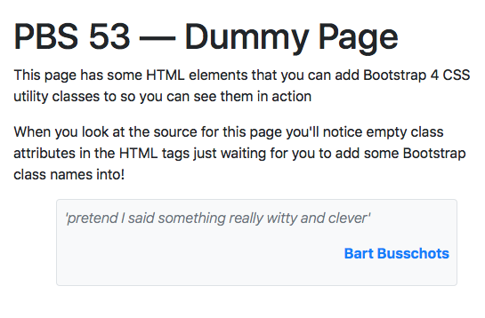
Let’s finish off the quotation in our dummy page by aligning the author to the right and making it bold, and making the quotation italic and light:
<blockquote class="text-muted bg-light border rounded p-2 m-3 ml-5">
  <p class="font-italic font-weight-light">'pretend I said something really witty and clever'</p>
  <p class="font-weight-bold text-right"><a href="http://bartb.ie/" target="_blank" rel="noopener">Bart Busschots</a></p>
</blockquote>
Here’s what the final product looks like:
Practical Example — An Extra Info Box
As an example, let’s see how we could combine these classes to quickly create an info box to add some additional information into my recipe in such a way that it’s clearly separate from the body of the recipe:
<aside class="m-5 border border-info rounded">
  <h2 class="bg-info text-light p-2">Did you Know?</h2>
  <p class="text-muted p-2">The Cucumber is a member of the nighshade family of plants, along with the tomato, the melon, and even the potato!</p>
</aside>
And this is what it looks like in the page:
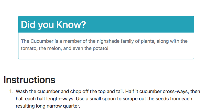
AS you can see, the entire box has a rounded bluish border and a very large margin because it has the CSS classes m-5, border, border-info & rounded. Let’s break that down — m-5 adds a large margin to all four sides, border adds a border to all four sides, border-info sets the colour of the border, and rounded adds the rounding to the border. You might think that if you use border-info you can get away without also using border, but you’d be dead wrong! Why? Because border-info only sets the border colour; it does not set the border width; that’s what border does.
Similarly, the heading is given a background colour with the class bg-info, white text with the class text-light, and relatively small padding with on all four sides with the class p-2.
Finally, the text in paragraph is toned down by giving it the class text-muted, and a small padding is added to all four sides with the class p-2.
Challenge
Firstly — using what we’ve learned today, improve your recipe from the previous challenge by adding some kind of clearly differentiated message, perhaps an aside with an interesting factoid or a warning message calling the reader’s attention to a particularly critical point.
Secondly — bulk out your recipe a little so it contains at least one bulleted list (<ul>), block quote (<blockquote>), figure (<figure>), and definition list (<dl>). If you’re struggling to find an opportunity to use a definition list, you could write a glossary of any fancy culinary terms you use.
Finally — make any other improvements you think make sense.
Final Thoughts
In this gentle introduction to Bootstrap, we’ve learned about some of the utility CSS classes the library provides. In the coming instalments we’ll learn about a few more utilities before moving on to look at how Bootstrap can be used to improve the rendering of standard HTML content like titles, paragraphs, lists, tables, quotations, figures, and more.