Nov
18
The Irony Of Leopard – Old is Better than New
Filed Under Computers & Tech on November 18, 2007 at 11:18 pm
I have Leopard running on a range of machines from a first generation MacMini with a G4 processor and 32MB of graphics RAM, to a 17″ MacBookPro with a CoreDuo and 256MB of graphics RAM. Leopard runs brilliantly on both machines, however, there are some subtle differences in the visual window-dressing Leopard chooses to use on these two machines. This results in Leopard being a little more visually pleasing on one machine than on the other. Naturally you’d assume that it’s the modern machine that gives the best experience, but you’d be wrong. Surprisingly and somewhat ironically it’s the old G4 on which Leopard looks the best. This is because some of the fluff is disabled on older machines like the G4 MacMini. The two biggest differences are in the presentation of the Menubar and TimeMachine.
[tags]Apple, OS X, Leopard[/tags]
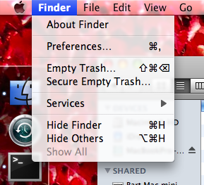
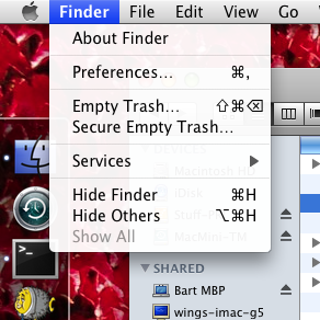
Let’s start with the most visible of the two, the menubar. You look at this thing all day every day and it performs a vital role within the OS. The Menubar hosts the menus for all programs, provides access to a number of system properties, and houses status information for some third party app. With such a vital role to play you’d imagine that keeping the menubar clear and easy to read would be a primary goal for Apple. Not a chance, they have gone for form over function and made it semi-transparent. What’s worse is that the content of all the menus it hosts are also semi-transparent! This makes the menubar fade into the background and makes its contents harder to read. Both bad things. However, on older systems this behaviour is turned off. The two screen shots below show the difference. I’m sure you’ll agree that the second one, the one from my old MacMini, looks much clearer and is hence better.

MacBook Pro

G4 MacMini
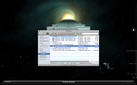
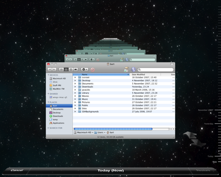
Secondly, we come to TimeMachine. When you use TimeMachine your Finder window moves into a new space where you see older versions of your folder stretching back to infinity. You move through time by moving through these folders or by moving along a time-line at the side of the screen. So far this is an excellent interface. However, the decoration on it is a bit much. The Finder windows are heading back in time towards some huge big-bang-like singularity and there are stars moving out from that singularity constantly. It’s almost enough to make you travel sick! So, how is this different on the old MacMini? The interface operates in the exact same way, it’s just the decoration that’s different. There’s no singularity, and no moving stars, just a simple static starry background. The screen shots below require a little imagination because for the top one you have to imagine those stars constantly and continuously moving towards you as if you’re heading through space at warp 1! Again, the lower screen shot is the one from the old G4 and again I find it much more pleasing to the eye.

TimeMachine on MacBook Pro (remember, the stars are all moving) – Click to Enlarge

TimeMachine on G4 MacMini (remember, the stars are stationary) – Click to Enlarge
All this goes to show that, really, less can often be more. This is a point that is generally not lost on Apple. In fact, in many ways the are the masters of this philosophy. However, with some aspects of the Leopard GUI they have clearly lost sight on that philosophy in their attempt to out-bling Windows Vista. On earlier versions of OS X Apple introduced terrible horizontal lines in the backgrounds of menus and some other OS elements. People hated these because they were totally OTT. With each subsequent release of OS X these lines were toned-down getting more and more subtle until they finally disappeared completely in Leopard. I imagine we’ll see Apple do something similar here. They won’t make a total U-turn because that would look bad but they’ll slowly reduce the transparency of the menu and tone down TimeMachine until we end up with something much more understated and much more Mac-like.


[…] The Irony Of Leopard – Old is Better than New […]
I have g4 and the stars don’t move. I want them to, is their a way to make them move? Please email me the answer.
Hi Daniel, I really don’t think there is. These kinds of effects rely on modern graphics cards, the old G4s just don’t have cards that can cut the mustard as it were.
Sorry I can’t be of more help,
Bart.
Thanks for the continued excellence in your blog. I have been holding off on upgrading my Intel iMac to Leopard for fear of losing the many little applications I have purchased.
Is the current release safe for installing over the existing OX and retaining installed application?
Thanks
Sam
Hi Sam,
Thanks for your kind words. Most apps worked fine on Leopard the day it came out, and at this stage there are patches available for most of those that didn’t. I don’t think compatibility is a big problem with Leopard at this stage.
As for how best to install it, opinion is very much divided on that. Allison from the Nosilla cast tried an over-install and things went very funny for her. She ended up just doing an erase and install in the end. However, others have done ‘dirty installs’ (as I call them), with no problems at all. Personally I always do an erase and install for any OS upgrade. I used to do it on Windows, I do it on Linux and I do it on OS X. I like to make a clean start from time to time. I look at it as a spring clean for my computer.
In short, theoretically it is fine, some people have had problems with it, so I’d recommend an erase and install or an archive and install.
What ever you chose to do, I hope it goes well for you.
Bart.